|
|
2 years ago | |
|---|---|---|
| .. | ||
| backp | 2 years ago | |
| frontp | 2 years ago | |
| cover.jpg | 2 years ago | |
| dis1.png | 2 years ago | |
| dis2.png | 2 years ago | |
| dis3.png | 2 years ago | |
| index.html | 2 years ago | |
| legs.stl | 2 years ago | |
| pngs.png | 2 years ago | |
| readme.md | 2 years ago | |
| terms.json | 2 years ago | |
| webps.png | 2 years ago | |
readme.md
3d spin !!!
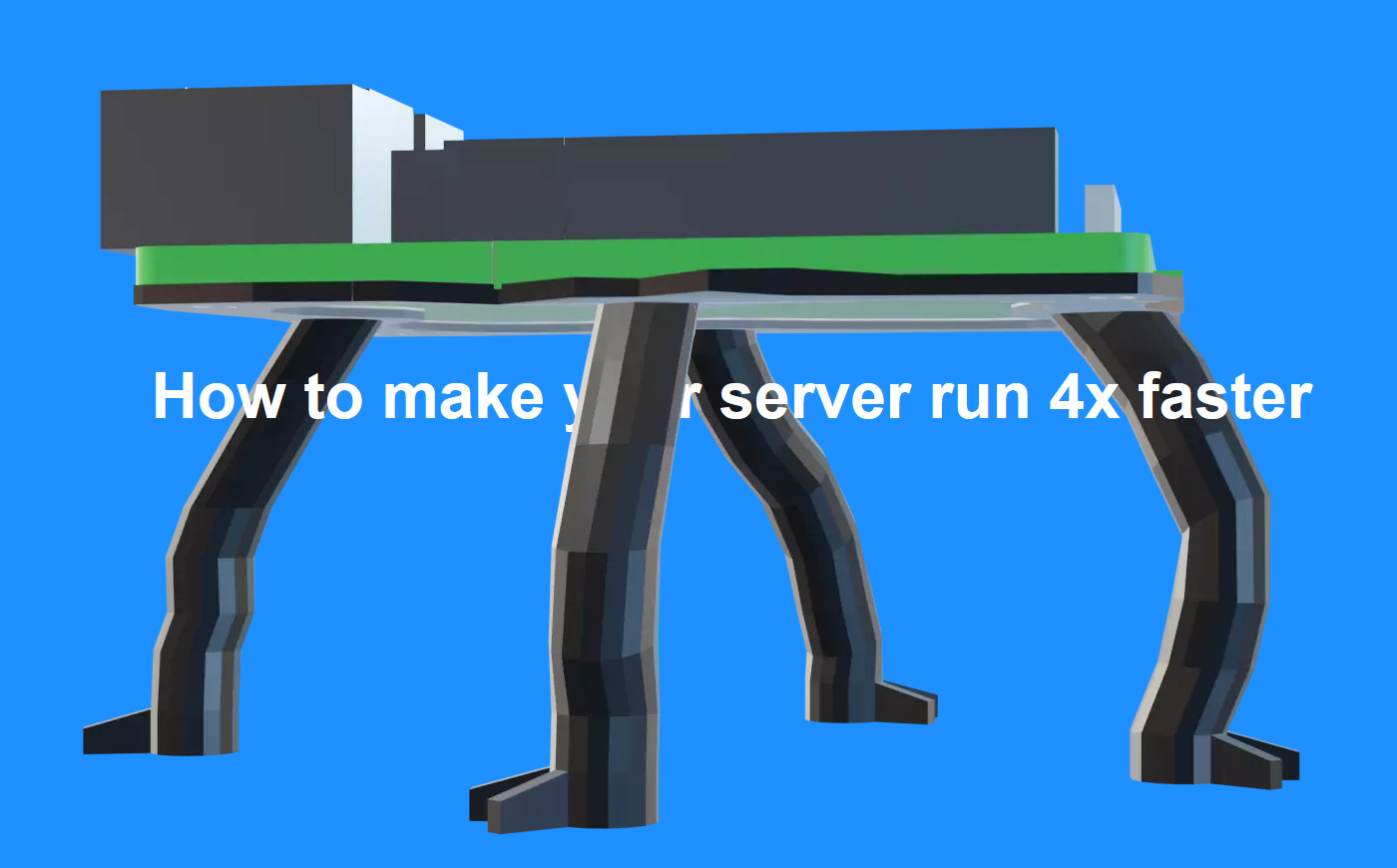
An impostor 3d spin that uses pictures of a rotating object (in this case: soupboat) to fake 3d rotation.
This is a prototype for the grad project website! Actually the plan is to use real pictures of the soupboat and its 3d printed legs. But need to take pictures first, so here a tryout with a render.
Bonus: this happen twice: one for the background and one for the foreground. In this way we can fake depth having something passing in front and something in the background. Checkmate depth buffer.
Some problems concerning images
This technique uses a lot of images. The script can be easily adjusted to regulate how many of them, for this first tryout i tried with 36 images for a round. (360 degrees/10). Probably could work fine just halving them, and have only 18 angles.
The point is:
- 36 images for the front +
- 36 images for the back
- = 72 pictures in total
Not really the most exciting thing to do in a website right? Take into account also the question of transparency, and suddenly the idea to have seventy png files to swap and change and download on the fly makes your cursor wandering around the browser feeling dizzy.
Then I remember that webp image format exists, and I can apparently use it. It's an image format developed by Google so my inner cop was copmlaining, but look at these:
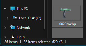
 List of 36 png files, for 40mb
 List of 36 webp files, for 600kb
So i would say webp is definitely a way to go here: you get lossy compression same as jpeg, but with the bonus of transparency like png. I would say that this is a nice deal.
Confront discomfort
While figuring out what to do for my graduation project, the moment to decide where to make this thing public arrived. A collection of readme files is something quite digital, hence I thought ok so then it's a website? So then it's a website! So then it's a website... The instant reflex to associate digital contents with websites caused some discomfort: why do I end up always here? I feel so bored of my patterns.
During a tutorial, Manetta suggested to stay with this discomfort for a while. To scratch a bit under its surface to see what's there. Some months ago I wrote this 30% exhausted vent in the readme of wlist:
A small writing machine to experiment the list format. It's again web-to-print, it's again flask, it's again markdown, it's again it's again it's again. I'm 30% sorry.
Here a bit of context: my relation with the browser started to get complicated following a growing interest in permacomputing practices, that caused an initial allergic reaction to all kinds of javascript based applications included the one i most work with on a daily bases.
( need to elaborate this a bit more )
( possibly continuing here )


