Processing is a free, open source programming language and environment used by students, artists, designers, architects, researchers and hobbyists for learning, prototyping, and production. Processing is developed by artists and designers as an alternative to proprietary software tools in the same domain. The project integrates a programming language, development environment, and teaching methodology into a unified structure for learning and exploration.1
Teaching programming with free software to media design students for years, I’ve resisted Processing as it has always seemed to me to embody a particular kind of solipsism of digital interactivity and graphics that I want my students to avoid.
In the fall of 1996, John Maeda joined the MIT Media Lab to replace the recently deceased Muriel Cooper. Cooper was the first art director of the MIT Press, producing influential designs such as a 1969 catalog of the Bauhaus and the iconic MIT Press logo, a Bauhaus-inspired stylized graphical rendering of the letters “mitp”. Cooper started the Visible Language Workshop, later one of the founding groups of the MIT Media Lab, to research the intersection of publishing, design, and computation.

Our forefathers at the Bauhaus, Ulm, and many other key centers for design education around the world labored to create a sense of order and method to their teaching. Thanks to their trailblazing work, teaching at the university level gradually became accepted as a meaningful and constructive activity. A drawing board, small or large, became the stage for paper, pen, ink, and blade to interact in the disciplined activity that characterized the profession of visual design.2
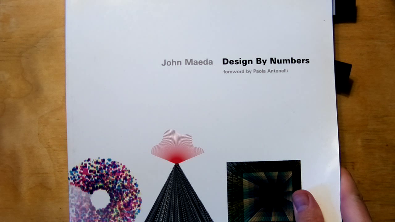
Maeda created the Aesthetics and Computation group in part to continue Cooper’s research. Maeda developed (with students Tom White, Peter Cho, Ben Fry, and later Casey Reas among others) a software system called Design by Numbers3. It had extreme constraints such as a fixed 100 by 100 pixel size and monochrome-only graphics. The command set is similarly constrained with only two drawing commands for lines and points. Commands like “paper” and “pen”, controlling the gray value of background and foreground colors, invoke the materiality of a (pre-digital) print practice. The accompanying print publication also had a square format.
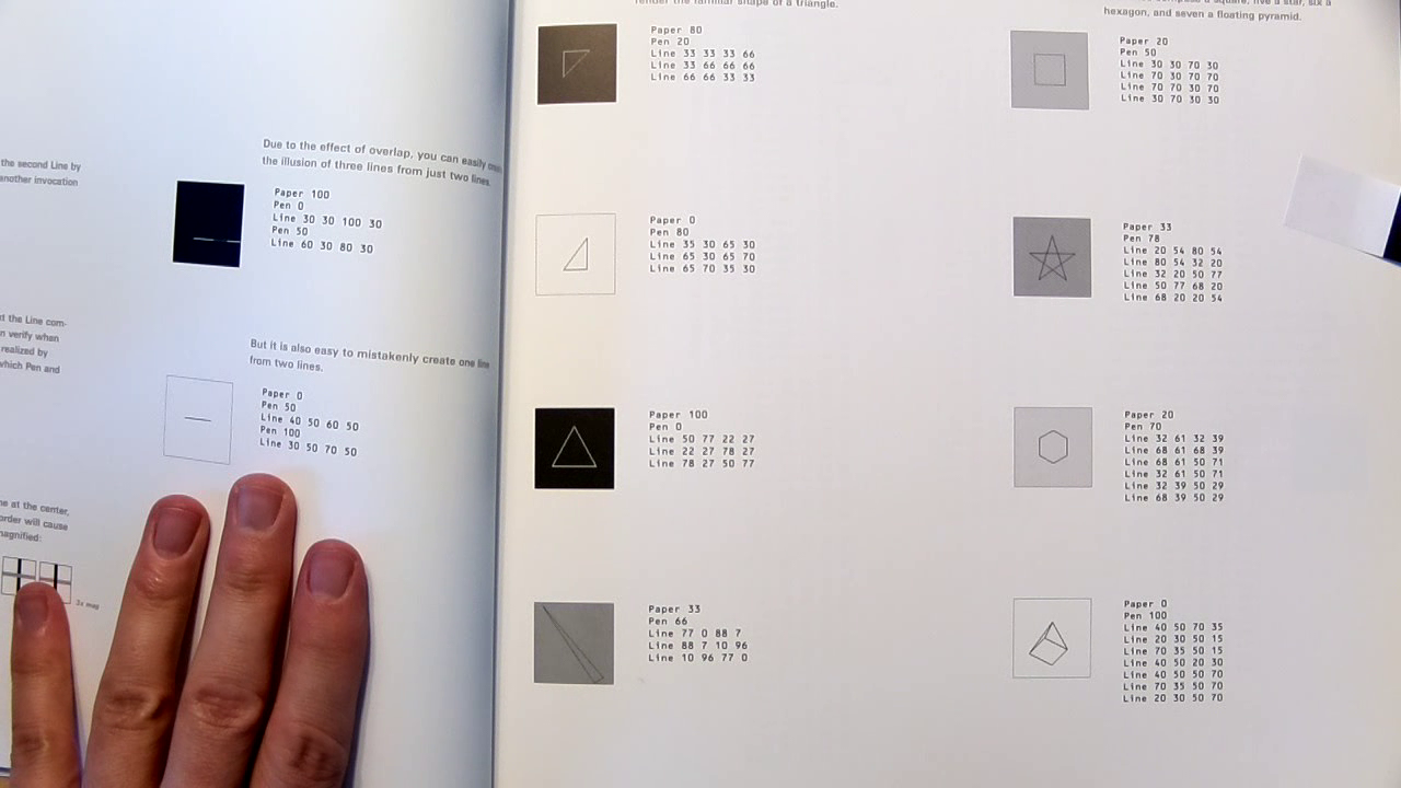
When designing this system for learning basic computational media design, I intentionally limited the set of commands and constructs to a minimal number of possibilities. If I had given you drawing capability beyond a line or setting a dot, the examples could have been more exciting, but the point could not be made clearly because your attention would be drawn to the picture and not to the code.4
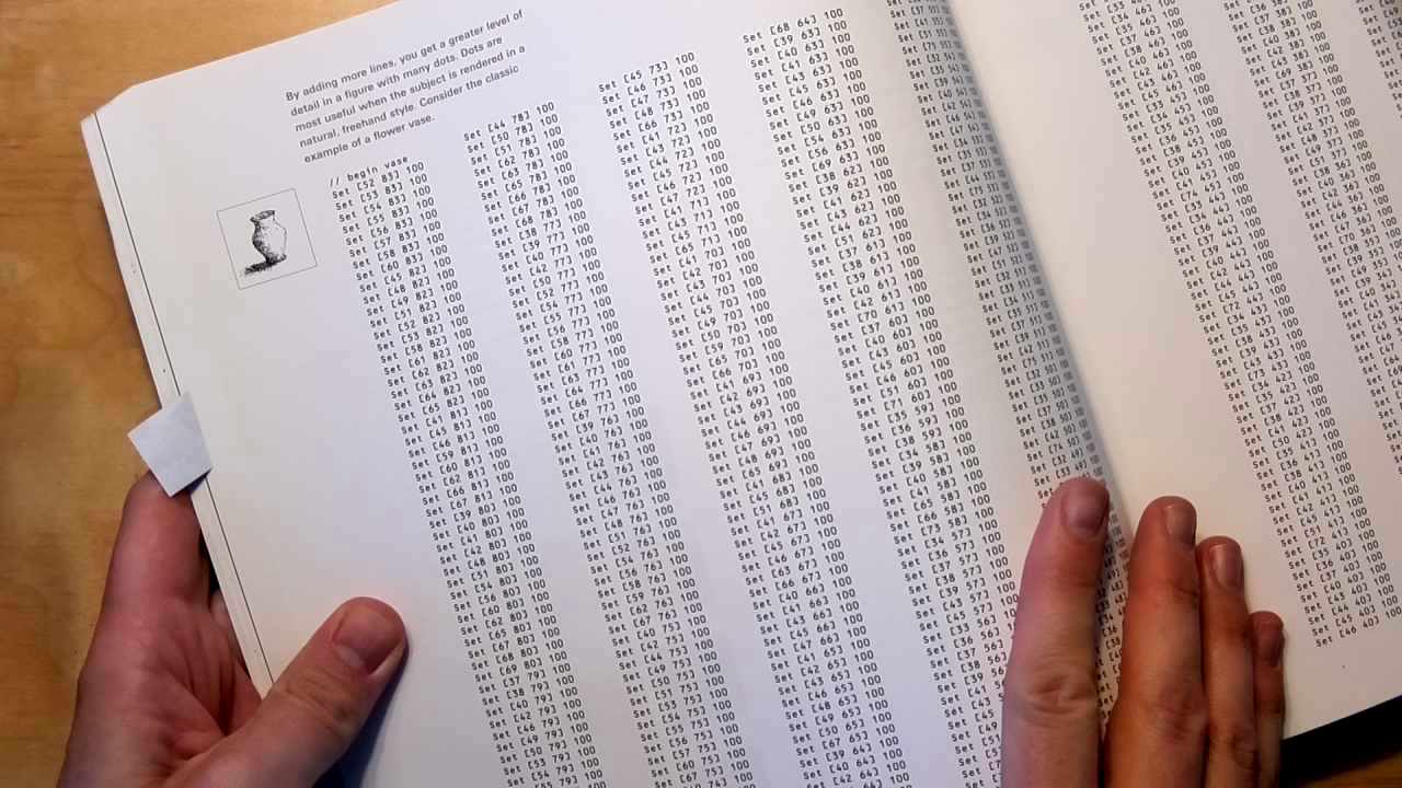
This valorization of “code” over picture is evident in the book spread where a digital image of a vase is presented along with its “code”: a sequence of “set” commands describing the image pixel by pixel. Though it’s possible that such an image might be produced in this way (discipline!) in practice such images are created by translating a digital photograph using one of a family of techniques known as “dithering” to produce a pixelated image with limited gray values. Here these tools and techniques are unmentioned, with expansive space given instead to the listing of numbers.
I remember sitting with a friend at his Commodore 64 in the 1980s typing lines and lines of “poke” commands with digital data from the pages of home computer magazines to reproduce simple games. These pages would typically use compact representations (like hexadecimal) and include things like “checksums” and bootstrap programs to help you correctly enter and verify the data you entered.
In the case of the DBN’s digital vase, the purpose does not seem to be for someone to actually type the numbers in, but rather to fill the pages of a book that seems destined for the coffee table rather than a desktop. Similar to the fields of 1s and 0s still popular as backgrounds of book sleeves and PowerPoint slides to suggest “all things digital”, the presentation is gratuitous and misleading in terms of actual practice. Like an observer unfamiliar with deaf culture confusing the hand gestures of finger spelling with the expressivity (and ambiguity) of actual sign language, the displays of 1s and 0s, or in this case of numeric coordinates and gray values, is a shorthand that refers digital practices without actually participating in them.
The above is just one example of DBN’s lack of historicity. The year is 1999, and for instance the Sony PlayStation and access to the World Wide Web are popular phenomena. Yet the text seems remarkably devoid of any reference to specific tools or practices. Even Maeda’s invocations of historical figures like the Bauhaus and Paul Rand are vague, evoking a sort of nostalgic Mad Men universe with the creative young men (those future forefathers) at their drawing boards and a sense of “timeless design values” like a devotion to discipline and order.
At the end of the book Maeda responds to a critique apparently made to him by one of the students doing some of the programming of the DBN system itself. Recounting how a visit to a “university-level Java class for designers […] teach[ing] the finer points of object-oriented programming and bit masking of 24-bit color values” made him feel “lost in all the gibberish”, he reasserts his pedagogical approach as an alignment with the “simplification” that is the “constant goal” of programming.5 Rather than trying to bridge the gulf between diverse practices, Maeda dismisses that which he doesn’t (care to) understand in the name of simplification.
Processing was born as kind of fork or remake of DBN. Like DBN, Reas and Fry built Processing in Java, a desktop application that exists outside of the web but which can be used to publish sketches as “applets” embedded in a web page and published online. Reas and Fry added commands to work with color and multiple output sizes, as well as commands to draw basic shapes like circles, rectangles, and triangles.
Processing sketches consists of (at least) two functions: setup which is invoked once and draw which is invoked continuously; the default frequency being the refresh rate of the computer’s display (typically 60 times per second). By using variables combined with input functions allowing access to the mouse and keyboard, graphics can be made dynamic and responsive to the user. In addition, graphics by default are rendered using a technique known as “anti-aliasing” to appear “smoother” and less pixelated.
Most of the examples presented in this book have a minimal visual style. This represents not a limitation of the Processing software, but rather a conscious decision by the authors to make the code for each example as brief and clear as possible. We hope the stark quality of the examples gives additional incentive to the reader to extend the programs to her or his own visual language.6
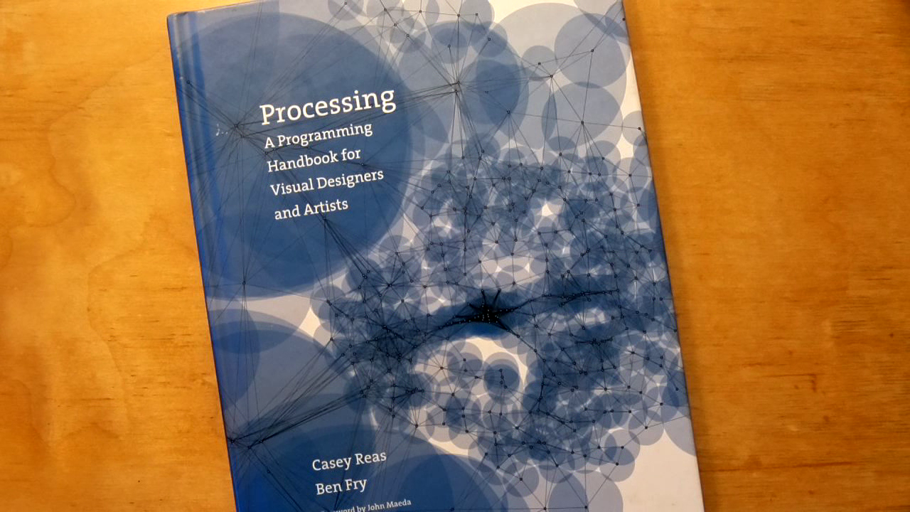
Processing: A Programming Handbook for Visual Designers and Artists is published in 2006 by the MIT Press, with Reas + Fry authors, and a foreword by Maeda. The book comprises over 700 pages and is organized by topics like: color, control, data, drawing, image, input, math, motion, structure, typography. The book follows the visual style of the DBN book, with small square (mostly) monochrome images accompanying concise listings of code.

Despite the claim of leaving space for others to bring their own “visual language”, and thus an implicit proposition of its own aesthetics as “neutral”, Processing embodies a very particular set of values and assumptions. The framework valorizes smoothness and fluidity, that leads one to imagine interactivity as that which happens on the surface of a sketch, rather than say in the network, or among collaborators. The mechanism of the “draw loop” assumes that code runs in a negligible amount of time, that is less than the refresh rate (and the default 1/60th of a second). This particular, again implicit, relationship with time places the programmer in an adversarial relation with the processor of the viewer’s computer and makes it all too easy (certainly for novices) to produce code that makes the viewer’s computer struggle and lag.
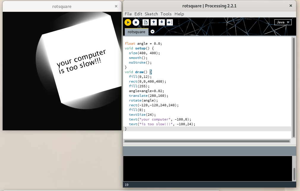
Unlike DBN, the processing book contains extensive interviews with artists working with digital tools, mostly using a variety of tools outside of processing like C++, PHP and Flash. Despite the “minimalism” of the examples, the book’s subtitle claims relevance to a broad audience of “visual designers and artists”. The link to Processing is often unclear.
There’s a strange disconnect where a diversity of visual and computation practices are shown, such as sequential images to make animations, or cellular automata, but the only real link to processing seems to be as a kind of universal “blank canvas” onto which all kinds of (digital) practices can be projected.
Another disconnect occurs when one crosses out of what the software makes simple. For example, while very easy to make a sketch respond to mouse clicks, responding to a mouse click on a specific shape, suddenly involves using Java classes and adding code “hooks” to your draw loop to make sure the pieces work together. While this kind of code is not itself so unusual, the transition is really abrupt because the core abstractions are so simplified, there is no bridge.
Still another disconnect involves processing sketches when published online. Web pages have structures for text layout and content flowing, and structural elements (like checkboxes and links) that inherently respond to mouse clicks. There is a a built-in standard mechanism (the so-called DOM or document object model), to further customize these behaviors. Processing sketches, even situated in a web page, don’t participate or give access to this model, nor does the framework offer using alternative graphical elements like SVG7.
In 2004, Reas co-developed an exhibition at the Whitney gallery called Software Structures. Invoking Sol Lewitt’s wall drawings as an inspiration, the project presents a series of abstract rules (or software structures) for the production of an image, including some from Lewitt. The rules were then implemented using a variety of “materials”: Processing, Flash MX, and C++.
A benefit of working with software structures instead of programming languages is that it places the work outside the current technological framework, which is continually becoming obsolete. Because a software structure is independent from a specific technology, it is possible to continually create manifestations of any software structure with current technology to avoid retrograde associations.8
In 2016, the Whitney published a “restored” version of Software Structures.9 As technologies like Java and Flash had then for reasons both technical and commercial fallen out of popular use on the web, the new version featured many of the processing sketches adapted by Reas to use p5.js, a recent port of processing to Javascript made by artist Lauren Lee McCarthy.10
Despite the project’s earlier stated interest in exploring diverse “materialities”, it’s telling that rather than considering the older processing implementations as a different material and presenting screenshots of them as was done for the Flash and C++ examples, the “restoration” maintains the illusion of a “permanence” to the processing sketches, placing them closer to those imagined “software structures” than to “retrograde” technologies like Java or an out-dated browser. In addition the “adaptation” elides the work of the development and subsequent implementation of the then recently standardized canvas element11, as well as that of the creation of the p5.js library.
In 2007 I attended a book launch of the Processing Handbook. Earlier in the day, I had bought another technical book “ImageMagick Tricks: Web Image Effects from the Command line and PHP” by Sohail Salehi12. While waiting for the presentation to begin, I met Casey Reas at the back of the room. He was curious about the book I had with me and looked briefly at it. He had never heard of ImageMagick.

ImageMagick started with a request from my DuPont supervisor, Dr. David Pensak, to display computer-generated images on a monitor only capable of showing 256 unique colors simultaneously. In 1987, monitors that could display 24-bit true color images were rare and quite expensive. There were a plethora of chemists and biologists at DuPont, but very were few computer scientists to confer with. Instead, I turned to Usenet for help, and posted a request for an algorithm to reduce 24-bit images to 256 colors. Paul Raveling of the USC Information Sciences Institute responded, with not only a solution, but one that was already in source code and available from USC’s FTP site. Over the course of the next few years, I had frequent opportunities to get help with other vexing computer science problems I encountered in the course of doing my job at DuPont. Eventually I felt compelled to give thanks for the help I received from the knowledgeable folks on Usenet. I decided to freely release the image processing tools I developed to the world so that others could benefit from my efforts.13
ImageMagick, first released in 1990, is a popular free software tool that’s often referred to as a “Swiss army knife” due to its ability to convert between hundreds of different image formats, and for the many built-in features to filter, manipulate and generate images. Thanks to the software being “not chemically or biologically based”, Cristy was able to release the software as free software (echoing the way the UNIX operating system became free software due to its marginality to the interests of Bell Labs). The software is full of particularities. For instance, there are a number of built in images including a wizard (the mascot of the software) seated at a drawing table contemplating an image of the Mona Lisa.
ImageMagick is a command-line tool, designed to be used via textual commands. The typical usage of ImageMagick is to take one image as input, applying one or more transformations to it, and output a new image. In this way the tool can be used repeatedly in so-called “pipelines”, or otherwise composed together in structures called (shell) scripts. In these scripts ImageMagick commands can be mixed with other commands from any software installed on the user’s computer that also provides a command-line interface.

Salehi’s book directly reflects the structure of ImageMagick, with chapter organized around various incorporated “tools”: convert, mogrify, composite, montage, identify, display, conjure. The examples are practical, creating logos or adding captions or a border to an image. One example renders the word “Candy” with colorful stripes. Another series of examples duplicates and inverts the image and text of classical Persian poet “Hafez” to create a kind of playing card. Another example uses ImageMagick in conjunction with PHP and HTML to produce an online “e-card maker”, a sequence of commands is demonstrated to render the text “No More War” (in a dripping paint font), deform it, and project it onto the side of a chess piece.
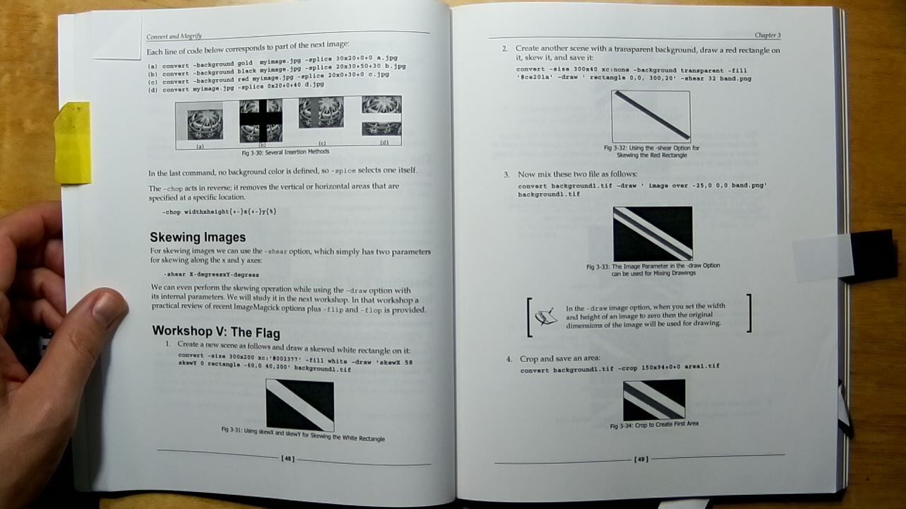
In another extended example, a flag is constructed in steps. Rather than approaching the project as drawing geometric forms on a canvas, Salehi uses the diversity of ImageMagick’s manipulations, performing a series of commands whose textual names invoke a sense of physical construction: blocks of color are skewed, sheared, cropped, flipped, flopped, and finally spliced (with “gravity” set to center). The approach creates a number of intermediate images, thus creating the digital equivalents of “cuttings” or leftover materials in the process.
By modifying the first step to use an image14, I produced the following (intermediate) results:



In the 1920s Russian avant-gardist El Lissitsky would move to Berlin and produce work that was highly influential to the then nascent Bauhaus. In 1923, Lissitsky illustrated a publication of poems by friend Vladimir Majakovskij. In it he created graphical forms by mixing typographic elements with geometric forms created by (mis-) using spacing or “blind” elements typically used to create negative/unprinted space between lines of type, as positives producing geometric forms. This style, sometimes called constructivism, was part of an effort to make a radical break from traditional styles of typographic layout and illustration using the means then available for print. The book is notable for its “interactivity” via iconic tabbed pages.
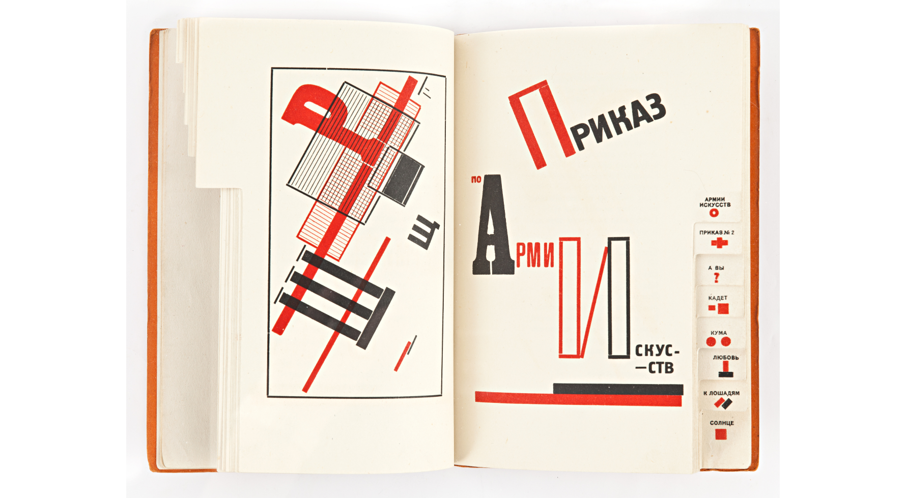

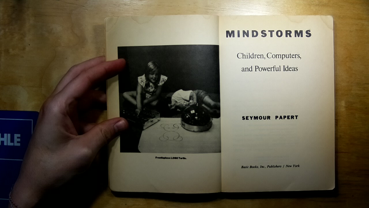
Constructivism is also the name given to the pedagogic project associated with Seymour Papert. In the 1970s Papert co-developed a pedagogy for teaching children mathematics and programming based on the LOGO programming language. Part of the system was a (virtual) robotic turtle that could be programmed to draw figures. The system, known as Turtle graphics, had commands like: forward, turn left, turn right, pen up, pen down, that directly addressed the “turtle” to draw shapes while moving.
The process reminds one of tinkering: learning consists of building up a set of materials and tools that one can handle and manipulate. Perhaps most central of all, it is a process of working with what you’ve got. …. This is a science of the concrete, where the relationships between natural objects in all their combinations and recombinations provide a conceptual vocabulary for building scientific theories. Here I am suggesting that in the most fundamental sense, we, as learners, are all bricoleurs.15
Papert described the pedagogic project of LOGO in book titled Mindstorms. In a key example, Papert describes how students can be taught about circles by imagining (or better yet themselves enacting) the turtle repeatedly performing the sequence “go forward a little, turn a little”. He contrasts this with the formal equation of a circle (x2 + y2 = r2) typically taught in an elementary school geometry class.
TO CIRCLE REPEAT [FORWARD 1 RIGHT 1]
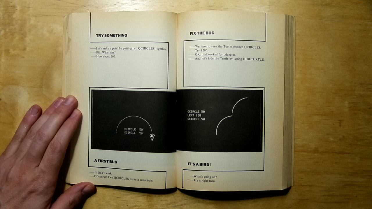
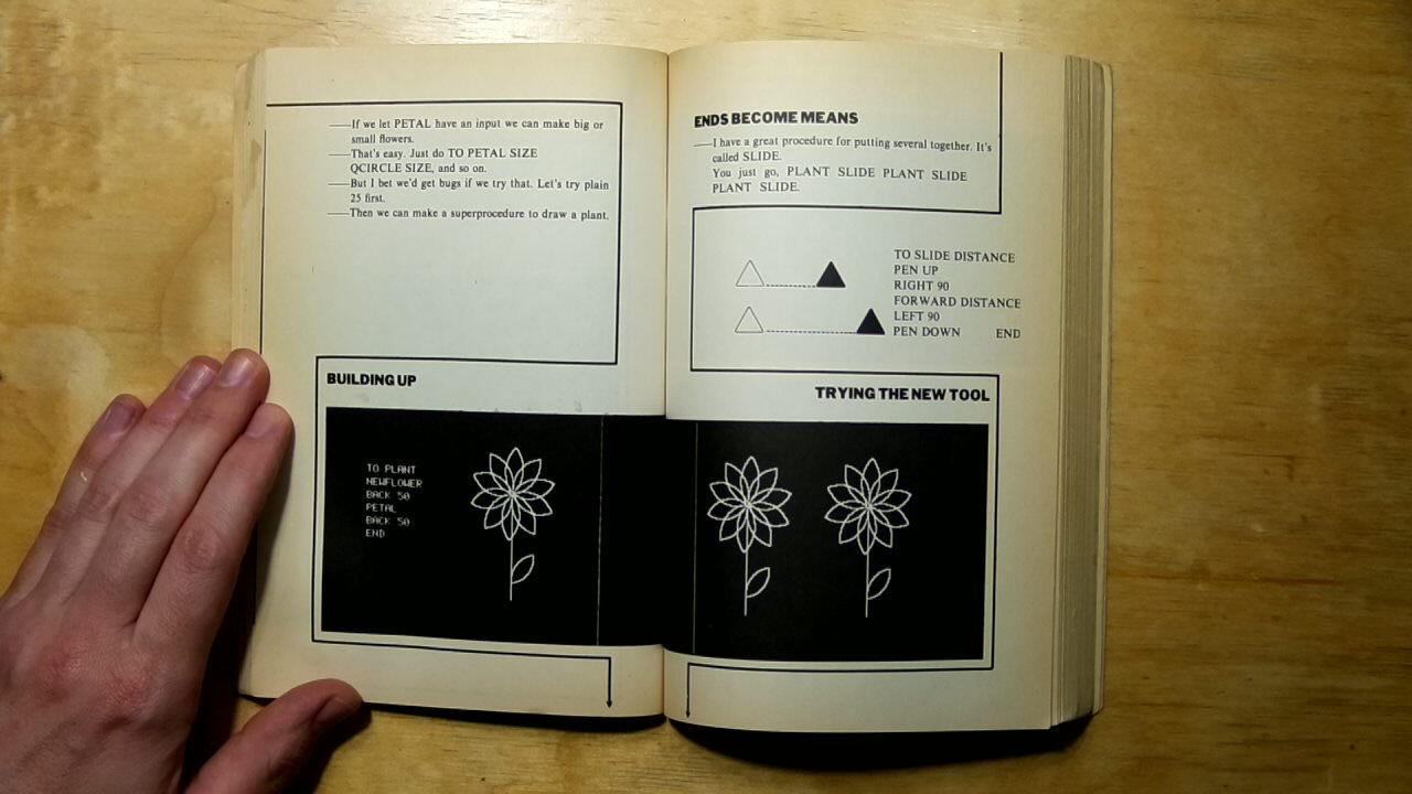
In a powerful central visual sequence, Mindstorms presents a series of illustrations showing the screen output of code alongside a running dialog. The conversation starts with a proposition to draw a flower like one sketched on paper. First they consider what programs they might already have to make use of, in this case they have a procedure to draw a quarter circle. Through a series of steps, mistakes are made, plans are adjusted and retried, happy accidents lead to discoveries (it’s a bird!). In the process the “ends become means” and a new tool is put to use to create a garden, and then, incorporating the “bug”, a flock of flying birds.
In Belgium, where I live “brico” is the French language equivalent to “DIY” and is often used in a derogatory sense to indicate that something is made in an amateurish way. Papert, is borrowing the term from Claude Lévi-Strauss, who first used the term in an anthropological context hypothesizing how “universal” knowledge might form from myth and fragmentary cultural knowledge16.
For Papert, bricolage exhibits a quality whereby informal methods not only appeal to “common sense” but also engage more profoundly with the materiality of its subject than would a formal approach. In the case of the circle, the “turtle” method is not only a way for the student to imagine the problem physically, it also relates to methods of differential calculus, something the algebraic formulation misses completely. In hacker circles, bricolage is evident in an approach of embracing “glue code” and “duct tape” methods, like the pipeline, that allow different systems to be “hacked” together to do useful (new) things.
Alfred North Whitehead, writing on the sciences, established an influential idea of a “fallacy of misplaced concreteness”. The idea is that making abstractions, such as what happens when a particular phenomenon is named, is a simplification that works by suppressing “what appear to be irrelevant details”.17 In Media Ecologies, Matthew Fuller extends this thinking to consider technical standards as “a material instantiation”18 of Whitehead’s misplaced concreteness, and considers how technical devices through a process of objectification “expect in advance the results that they obtain”.19
Susan Leigh Star takes Whitehead’s “misplaced concretism” and proposes a feminist methodology specific to information technology.20 Her essay develops the idea of “standards” as one type of “Boundary object”, which she describes as:
[…] those scientific objects which both inhabit several communities of practice and satisfy the information requirements of each of them. Boundary objects are thus objects which are both plastic enough to adapt to local need and common identity across sites.21
Star cites Donna Haraway, who wonders in A Manifesto for Cyborgs:
How do I then act the bricoleur that we’ve all learned to be in various ways, without being a colonizer…. How do you keep foregrounded the ironic and iffy things you’re doing and still do them seriously […]
Star draws on a tradition of diverse feminist thinking through the “articulation of multiplicity, contradiction, and partiality, while standing in a politically situated, moral collective” to synthesize and propose what she calls the important attributes of a feminist method:
- experiential and collective basis;
- processual nature;
- honoring contradiction and partialness;
- situated historicity with great attention to detail and specificity; and
- the simultaneous application of all of these points.22
As a teacher, I enjoy using tools like ImageMagick in my teaching as it embodies collectivity from its origins as a way to “give back” to a community sharing code over usenet, through to its continued development by multiple authors and relation to the larger free software community as an invaluable toolbox for extremely diverse practices. I find the experiential in the highly flexible commandline interface, itself also an example of honoring contradiction and partialness, with often more than one way to express the same transformation. The processual is implicit in its construction as a tool of transformation, encouraging an exploratory iterative approach to composing transformations to arrive at a desired outcome, often leading to misusage and errors that can be happy accidents and lead one to reconsider one’s goals. Finally, in its extreme support of hundreds of different formats, ImageMagick use often leads to the discovery and exploration of diverse image formats, each with related practices and histories.
In contrast, I find as a pedagogic project, I find Processing actively uninterested in its own underlying materiality, aspiring instead to a kind of disembodied and bland universality. Students are encouraged to explore the “world at large” by adding additional layers of technology in the form of sensors, rather than considering all the ways the technologies they use are already engaged with the world. The project’s “neutral” aesthetics while dimly echoing a once-radical Bauhaus aesthetic, ignores the larger pedagogic program of the historical Bauhaus’ engagement and experimentation with the materials of their (contemporary) technical production.
A concatenation of operations of misplaced concreteness thus allow the gaps, overlaps, and voids in the interrelated capacities of such systems to construct a more “accurate” account of its own operations.23
Fuller’s recipe for critical media engagement feels like the basis of what might be termed a digital vernacular. A digital vernacular is about working withing the constraints of available resources, rather than living with a fantasy of negligible time or unlimited storage. A digital vernacular rejects the sense of disembodiment, rather if locates itself in interactions between many bodies. A digital vernacular finds itself in conversational forms that are open to happy accidents. A digital vernacular rejects the “false neutrality” of the seamless universal design solution, embracing instead the tips and tricks of specific tools, in specific contexts. A digital vernacular tears open its seams proudly displaying its glitches and gaps. A digital vernacular rejects the illusory construction of an isolated artist sitting at a blank canvas creating works from scratch. Instead the digital vernacular thrives on working with the contingencies of existing systems, and embraces working with boundary objects as a means of bridging diverse communities of practices.
Casey Reas and Ben Fry, Processing: A Programming Handbook for Visual Designers and Artists (Cambridge: MIT Press, 2007), xxi-xxii.↩︎
John Maeda, Design By Numbers. (Cambridge: MIT Press, 1999), 19.↩︎
John Maeda. 144.↩︎
John Maeda. 252.↩︎
Casey Reas and Ben Fry, Processing: A Programming Handbook for Visual Designers and Artists (Cambridge: MIT Press, 2007), xxi-xxii.↩︎
A web standard for “scalable vector graphics”, SVG is more integrated into the DOM than are java applets (in classic Processing) or the canvas element (see p5.js).↩︎
Casey Reas, “Paragraphs on Software Art”, Software Structures, retrieved October 28 2021, https://artport.whitney.org/commissions/softwarestructures/text.html#structure.↩︎
Despite the seeming similarity of names, Java and Javascript are two completely independent and quite different programming languages. Adapting software from one to the other is not trivial. In making the adaptation McCarthy claims “diversity and inclusion as core values upon which the software is built”. See: https://lauren-mccarthy.com/p5-js and https://p5js.org/. However, most of the limitations I talk about here still apply to sketches made with the current version of p5.js.↩︎
https://html.spec.whatwg.org/multipage/canvas.html#the-canvas-element↩︎
Sohail Salehi, ImageMagick Tricks (Birmingham: Packt Publishing, 2006)↩︎
John Cristy, “History”, ImageMagick website. Retrieved from the Internet archive Oct 28, 2021, https://web.archive.org/web/20161029234747/http://www.imagemagick.org/script/history.php.↩︎
Image: https://commons.wikimedia.org/wiki/File:Boris_Johnson_official_portrait_(cropped).jpg, Ben Shread / Cabinet Office, UK Open Government Licence v3.0 (OGL v.3)↩︎
Seymour Papert, Mindstorms (Cambridge: MIT Press, 1980), 173.↩︎
Claude Lévi-Strauss. The Science of the Concrete. The Savage Mind (University of Chicago Press: 1966), Chapter 1.↩︎
Alfred North Whitehead, Science and the modern world (New York: Free Press, 1967), retrieved from the Internet archive Oct 28, 2021 https://archive.org/details/sciencemodernwor00alfr/page/52/mode/2up↩︎
Matthew Fuller, Media Ecologies (Cambridge: MIT Press, 2005), 127.↩︎
Matthew Fuller, 104.↩︎
Susan Leigh Star, “Misplaced Concretism and Concrete Situations: Feminism, Method, and Information Technology” (1994), Boundary Objects and Beyond (Cambridge: MIT Press, 2015)↩︎
Susan Leigh Star, 157.↩︎
Susan Leigh Star, 148-149.↩︎
Matthew Fuller, 104.↩︎